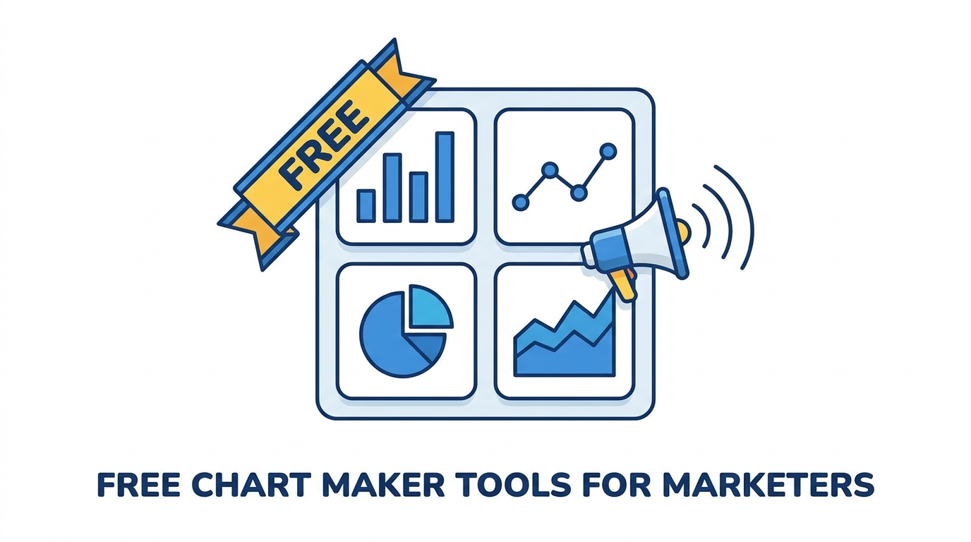
10 Free Chart Makers Every Marketer Should Know
Marketers create charts constantly: campaign performance decks, quarterly reports, social media graphics, and client presentations. Most of those charts don’t justify a Tableau license or an hour of Excel formatting. What marketers need is a fast, free tool that produces a clean chart from a small dataset.
Here are ten free chart makers worth bookmarking, organized by their strongest use case.
For AI-Powered Speed
1. ChartGen AI — The fastest option on this list. Paste your data or describe the chart in plain English and the AI generates it in seconds. Supports nine chart types including bar, line, pie, scatter, area, heatmap, waterfall, funnel, and combo charts. The free tier includes 50 charts per month, which is plenty for individual marketers. The output looks polished enough to drop directly into a slide deck.
2. Julius AI — An AI data analyst that generates charts from uploaded datasets. Better for exploratory analysis than quick chart creation, but useful when you need to ask questions about the data before deciding what to visualize.
For Spreadsheet Users
3. Google Sheets — If your data is already in a spreadsheet, Sheets’ built-in charts are good enough for internal reports. The collaboration features are the real draw: share the sheet and the chart updates for everyone. The weakness is styling, which requires manual effort for every chart.
4. Excel Online — Microsoft’s free web version of Excel includes the full chart engine. If you’re a Windows-first team, it integrates naturally with OneDrive and Teams. The chart options are more extensive than Google Sheets, but the interface is more complex.
For Design-Forward Output
5. Canva — Canva’s chart maker is built for visual appeal rather than analytical precision. It’s the right choice when the chart is part of a larger graphic (an infographic, a social media post, a newsletter header). The chart types are limited, but the templates make the output look professional with minimal effort.
6. Piktochart — Similar to Canva but more focused on infographics and data storytelling. The chart tools are basic, but the surrounding template library is strong for marketers who need to embed charts in visual content.
For Data-Heavy Teams
7. Datawrapper — A favorite of data journalists, Datawrapper produces clean, responsive charts that embed well on web pages. The free tier is generous, and the output follows data visualization best practices by default (zero-based axes, clean labels, accessible colors). Less useful for slide decks, but excellent for blog posts and web reports.
8. Flourish — Specializes in animated and interactive charts. If your marketing team publishes data stories on the web, Flourish’s interactive features (scrollytelling, animated transitions) are compelling. The learning curve is steeper than simpler tools.
For Developer-Adjacent Marketers
9. Rawgraphs — An open-source tool that handles unusual chart types (alluvial diagrams, treemaps, bump charts) that other free tools don’t support. The interface is less polished, but it fills a gap when you need a non-standard visualization.
10. Chart.js Playground — For marketers who are comfortable editing a few lines of JavaScript, Chart.js produces web-ready responsive charts. The online playground lets you prototype without setting up a development environment. Not for everyone, but powerful for teams with technical leanings.
How to Choose
For most marketers, the decision tree is simple. If you need a chart in under 30 seconds, use ChartGen AI. If the chart is part of a larger graphic, use Canva. If the data lives in a spreadsheet and the audience is internal, use Google Sheets. If the chart will be embedded on a website, use Datawrapper.
The best practice is to master one tool for your most common use case and keep one or two alternatives bookmarked for edge cases.